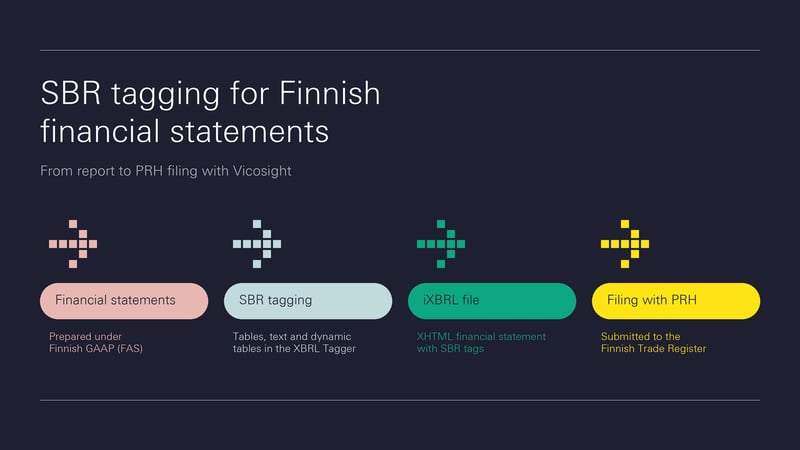
SBR taxonomy in Finland: iXBRL tagging for PRH filing with Vicosight
Discover how to navigate Finland's SBR taxonomy for iXBRL tagging with Vicosight, ensuring compliance for your digital financial statements.
5 min read

CtrlPrint has officially transformed into Vicosight, evolving from a trusted production tool into a modern digital ecosystem. Transitioning a 25-year legacy brand required a strategic vision that looked beyond a standard B2B identity.
In this article, we share the process behind this transformation, as well as the meaning behind our logos and the overall design choices for our new look.
Let’s hear how it all started from our Head of Marketing, Eleonora Cugurullo, and the design agency Purple Studio, which partnered with us on this project.
“I was lucky enough to join CtrlPrint fairly recently, at the end of 2024. When you join a company, it is really important to look at the branding and marketing with fresh eyes. This gave me a unique perspective - an outsider's view,” says Eleonora Cugurullo, Head of Marketing at Vicosight. “Once I started to learn about our company's mission, history, and the product development in the pipeline, it became clear to me that our previous identity and name were no longer supportive enough. We needed something on a broader spectrum that could really propel us forward and better represent our new and future achievements.”
Eleonora started her career as a designer, building experience in branding and fuelling her passion for graphics, colours, and visual identity systems. This was instrumental in the selection of our partner agency, the award-winning design studio Purple.
“When we initially met with design agencies, we were sometimes met with the assumption that we just wanted a 'standard B2B identity',” continues Eleonora. “But we wanted much more. We needed a brand that honoured our 25+ year history in corporate reporting while capturing all the exciting innovation coming to our platform.”
To bring this vision to life, Vicosight partnered with Purple Studio to craft an identity that honoured its long history while capturing the platform's upcoming innovations.
“The challenge was to evolve without erasing the past,” explains Sedir Ajeenah, Client Director and brand strategist at Purple Studio. “We wanted to carry 25 years of trust forward, while creating a brand that feels built for a collaborative, digital future.”
“We built an immediate rapport,” says Eleonora, “and I knew right away that they understood our vision. We needed an identity built to lead us through the decades ahead - and I truly believe we achieved that.”
 The designers at Purple Studio

The conceptual foundation of the Vicosight rebrand is anchored in structured collaboration and digital co-creation.
“Vicosight is ultimately about people creating something together,” Sedir notes. “We built the concept around that simple idea: individual contributions aligning into one clear, shared outcome.”
This narrative is brought to life through the new Vicosight symbol, which features individual inward-pointing arrows that form a star in the negative space.
“Our team interviews and deep dive into the product revealed something deeply human at the heart of Vicosight: collaboration,” adds Peter Herrmann, Lead Designer at Purple Studio. “We translated that idea into arrows representing individuals coming together, each contribution adding strength and direction until something greater emerges - a star.”
Perfecting this emergent star required immense precision, with many trials to find the exact balance.
“We wanted the star to feel discovered rather than simply drawn,” Peter explains. “As a designer, I spent a lot of time refining the mark, creating more than 50 different arrow shapes to find the perfect balance between the arrows and the emerging star. The final form is subtle, but that subtlety is what makes it meaningful: the star only appears when the individual elements come together.”

Vicosight serves a highly diverse user base, bridging the gap between structure and story by supporting finance, sustainability, investor relations, creative agencies, and auditors.
“One of the major complexities of our platform is the sheer variety of users we serve. We work with financial, sustainability, and investor relations professionals, alongside creative agencies, corporate comms teams, board members, and auditors. All of these stakeholders have distinct needs and come from very different backgrounds, speaking entirely different 'languages'. My primary goal for our communication strategy is clarity,” Eleonora highlights. “Across every stakeholder group, we strive to get straight to the point. It is not easy when your platform offers a multi-faceted product, so we ran extensive testing to present our core offering in the most straightforward way. I believe our new visual identity - especially the modular arrow system and distinct colour palette - plays a vital role in reinforcing this diversity of stakeholders and needs. It visually validates every user's contribution, and we look forward to making the most of these visual tools as we grow.”
The arrows immediately became a recurrent motif and theme for the new visual identity.
“I like how the arrow shifts between the individual and the collective,” says Peter. “It can represent one person, create patterns, suggest movement, or show direction. This makes the identity richer and helps people understand the purpose behind the arrows: every individual contribution is part of something larger.”


To communicate clearly across these distinct groups, Purple Studio built a visual system grounded in a well-defined grid and the Univers Next Pro typeface. Purple chose the typeface intentionally for its Swiss design heritage, refined proportions, and systematic structure. Its flexibility allowed them to create consistency across complex content while keeping the experience balanced and human.
“We created a clear structure through precise typography and a well-defined grid, signalling order and trust,” Peter states. “Colour, imagery, and motion then bring that structure to life. This balance feels very human: Vicosight gives everyone the framework to contribute and the freedom to create.”
This framework is reinforced by a distinct colour palette of dark navy blue, with accents of yellow, red, orange, electric blue, mint, and pink, alongside the modular arrow system, which serves to visually validate every user's unique contribution.
To stand out in the corporate reporting space, the new brand manual deliberately rejects generic stock photography in favour of powerful nature metaphors, such as a shoal of fish moving as one.
“We looked to nature for a more meaningful alternative to the stock imagery often associated with finance, reporting, and corporate communications,” says Sedir. “We were inspired by how nature shows individual effort and collective intelligence working together, reflecting something often overlooked: financial reporting is a true team effort.”
“We had a lot of fun using the photography guidelines of nature and animals on our website. They are meaningful, but can also be a little fun!” Eleonora shares regarding the new photography guidelines. “For example, we have a bird nurturing its babies on our 'Contact Us' page, as a metaphor of how we care for our own clients.”

“It's hard to pick a favourite element,” says Eleonora, “as there are so many things I love about our new brand identity, starting with the logo and the concept behind it, as well as the pink and mint colours in our new palette.”
“The arrows are my favourite,” replies Sedir. “They can represent one person, a direction, or an entire collective. I love how that flexibility keeps the idea of collaboration present throughout the identity.”
“I may be slightly predictable, but it’s the negative space in the symbol,” adds Peter. “The most important shape isn’t drawn; it only appears when all the arrows come together. I’m proud of the system’s flexibility: the arrows can work collectively or individually, representing how each contribution forms part of something larger.”
Orchestrating this cohesive, multi-channel rollout took almost a year of work, with the final five months dedicated exclusively to redesigning the website and marketing assets.
Supported by internal talent and partner agencies Purple, KiwiKiwi, Trickle, and Most Studios, Vicosight new identity is now fully realised.
“I would say that time and the right team made all the difference here. We worked on this rebrand project for almost a year, from the very first agency meeting until deployment, which was really important for developing a strong and cohesive message. We spent the last five months exclusively redesigning our website, trying to give full attention to every detail and not rushing the process. I was lucky to be supported by fantastic designers, marketers, and colleagues along the way, like my colleague Elena Barcaru, the rebrand-leading team, and all of our partner agencies.”
From design assets where an arrow dynamically shifts to denote a single contributor, to a unified digital ecosystem, the rebrand proves that every individual contribution is part of something much larger. Exactly as in our corporate reporting platform.
Explore Vicosight on our new website at www.vicosight.com.
Discover how to navigate Finland's SBR taxonomy for iXBRL tagging with Vicosight, ensuring compliance for your digital financial statements.
Take part in Vicosight’s State of Corporate Reporting 2026 benchmark. 8–10 minutes, anonymous, and every participant can receive the benchmark report.
Explore how AI is transforming corporate reporting and the implications of the European Single Access Point. Download our whitepaper for in-depth...
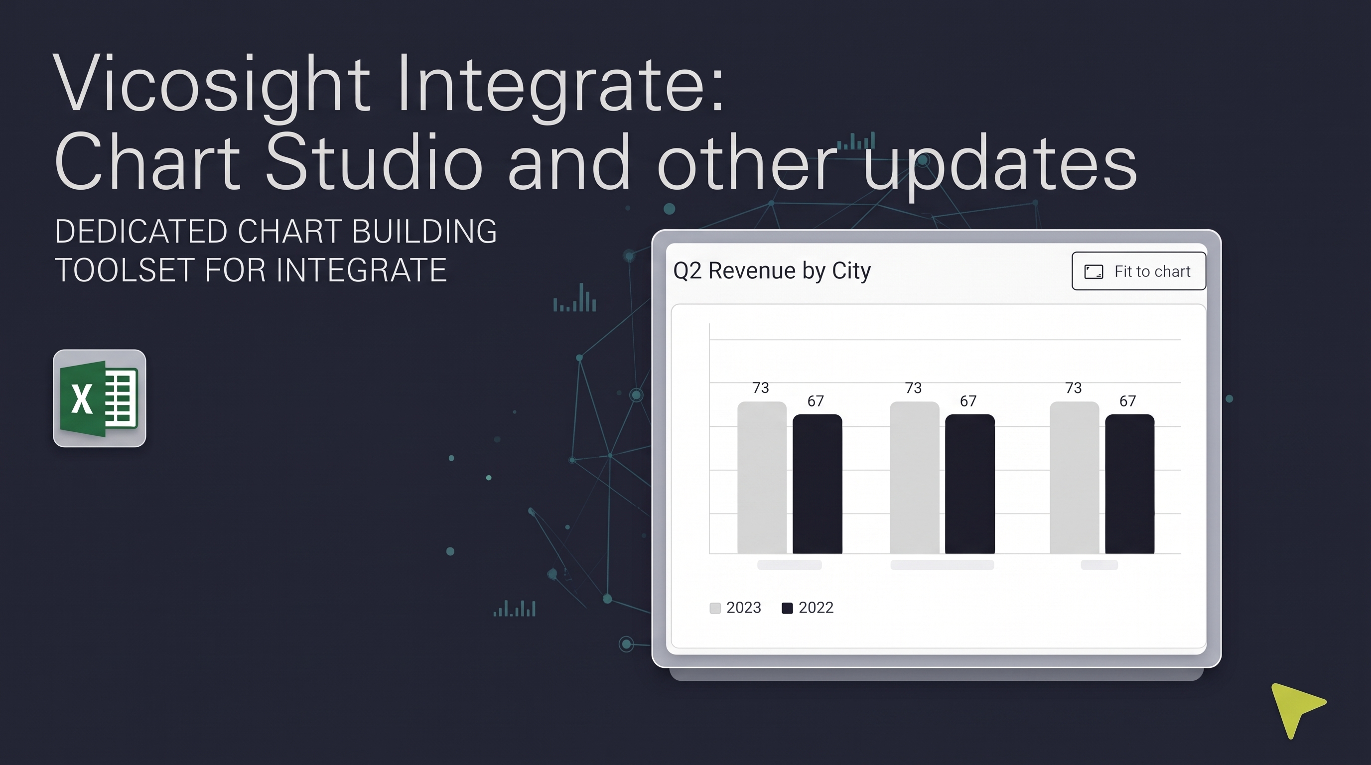
Discover the latest updates to Vicosight Integrate, including the new Chart Studio, improved Microsoft 365 connectivity, and enhanced data import...
CtrlPrint rebrands to Vicosight, uniting corporate reporting and collaboration in a secure platform that enhances compliance and innovation. Discover...
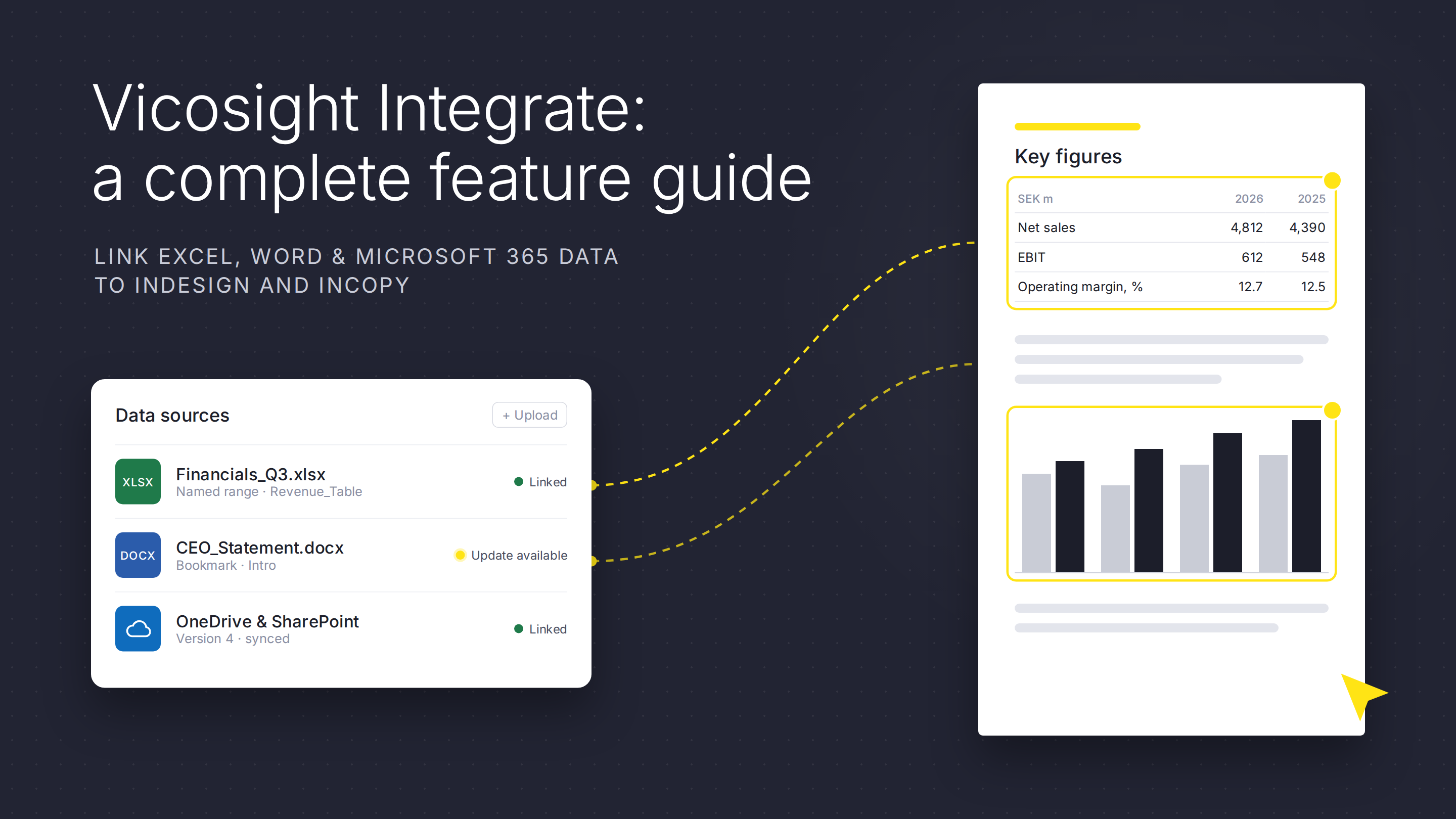
Discover how Vicosight Integrate streamlines data connectivity in InDesign and InCopy, enhancing efficiency with robust features for seamless content...